-
Fabrik Base 4.5 is now available.
See Announcements
Nvd3 Chart visualization
- Views Views: 34,871
- Last updated Last updated:
-
Introduction
The nvd3 chart is a horizontal or vertical bar chart.
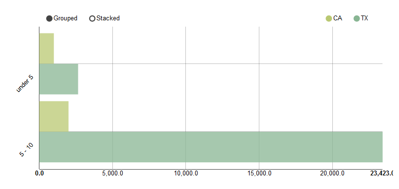
Say we have a Fabrik list with the following data, and we want to create a chart which shows the number of children in each state by age range. The field names are state, under5 and five_ten.

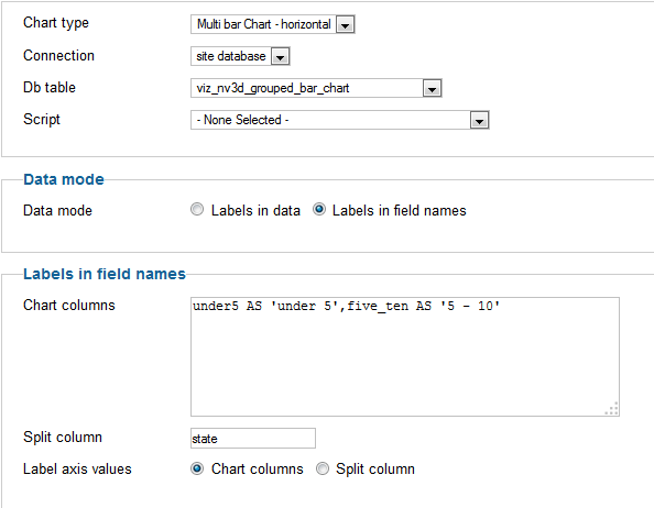
Add a new visualization and select 'nv3d_chart' as the visualization.
You then want to select the following Options:

and you will end up with a chart which looks like this:

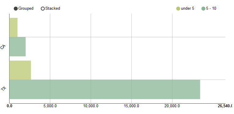
To swap over the state and ages, to obtain the following chart, set 'Label axis values' to 'Split column':

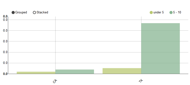
To swap the axis so that the values are on the Y axis change the chart from 'multi bar chart - horizontal' to 'multi bar chart'.
Also set the margin's property to something like '20,20,100,20' to give the x axis labels more space under the chart (otherwise they are truncated)
The new chart will look like this:


