Double css classes for lists with data joins

EricWebsite

Member
Hi,

I have 2 lists: a members list and a vehicles list (3 visible elements only).
The vehicle list ("voertuigen") is joined to the member list, repeatable so a member can add 1 or more vehicles.
On the form, I have the vehicle fields group on it's own tab.

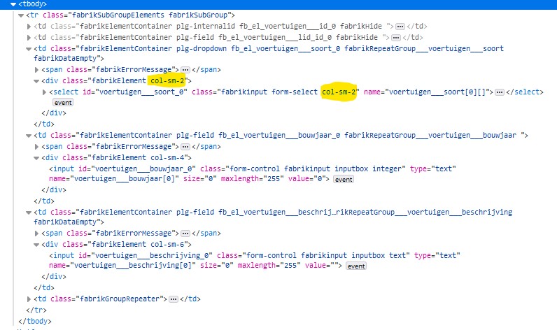
In the displayed rows, the col-sm-x classes are not applied to the td.fabrikElementContainers, but to the elements inside it.
This causes the element to occupy only a part of the (rather random) width of the container.
To make it even worse, for a dropdown the css class is applied twice, messing up the layout even more:
2024-04-14 114536.jpg

And by the way, the +/- buttons at the end probably should also have some css sizing to achieve a consistent layout.
 
So you are using the bootstrap_tabs form template and table display for the repeat group?

It can be discussed if it makes sense to use the element bootstrap width CSS in the repeat group table layout.
But maybe some people are using it this way.
In general it's up to you to select the width you want. If using elements in repeat group tables or in multi column groups I would always chose col-sm-12 (i.e. use the full width of the parent container)

You can use a custom template (or just try for testing directly)
in components\com_fabrik\views\form\tmpl\bootstrap_tabs\default_repeatgroup_row.php
line 34 remove
<?php echo $element->bsClass;?>

+/- buttons:
I think bootstrap_tabs is still missing some BS5 classes.
It it ok with the bootstrap template?
 
So you are using the bootstrap_tabs form template and table display for the repeat group?
Yes, if I use list for the repeat group then every vehicle takes up 3 rows, this more compact.

I would always chose col-sm-12 (i.e. use the full width of the parent container)
One could use col-sm-12 which has 2 problems:
1) those ugly page-wide dropdowns as in Joomla's module settings
2) even in list, for an element that needs a minumim width like a dropdown, a bootstrap class like col-sm-2 is wide enough on a large screen and too narrow on a small screen.

Styling options are limited. For the Dropdown element, not one entry in the settings on List view settings / CSS is actually being output to the screen, making styling through user.css difficult.
As a workaround, I ended up with this in user.css
:
Code:
#group14, #group18 {
  .col-sm-1, .col-sm-2, .col-sm-3, .col-sm-4, .col-sm-5, .col-sm-6, .col-sm-7, .col-sm-8, .col-sm-9, .col-sm-10, .col-sm-11, .col-sm-12 {
    width: unset;
  }
  .fabrikElementContainer.plg-dropdown {
    width: 150px;
  }
  .fabrikElementContainer.fabrikRepeatGroup___voertuigen___bouwjaar,
  .fabrikElementContainer.fabrikRepeatGroup___voertuigen___bouwjaar > .fabrikElement {
    width: 70px;
  }
  .fabrikElementContainer.fabrikRepeatGroup___voertuigen___beschrijving > .fabrikElement > input {
    width: 100%;
  }
}

You can use a custom template (or just try for testing directly)
in components\com_fabrik\views\form\tmpl\bootstrap_tabs\default_repeatgroup_row.php
line 34 remove
<?php echo $element->bsClass;?>

+/- buttons:
I think bootstrap_tabs is still missing some BS5 classes.
It it ok with the bootstrap template?

I will come back on this later.
 
We are in need of some funding.
More details.

Thank you.

Members online

Back
Top